ShopDreamUp AI ArtDreamUp
Deviation Actions

EDIT - Dec 08, 2013 - This is OLD, like really, really OOOOOOLLLLD and outdated, and there are better methods out there. I don't even do vectors this way anymore. That said, it's still useful as a guide on how to use the pen tool to make shapes specifically for pony vectors in a manner where they're layered efficiently easily modifiable. Just felt the need to point this out as I am still getting messages from people who don't understand that this is old and that I know there are alternative methods. I thank you all for your input.
Before I say anything, if you're familiar with proper vectoring at all then once you've heard what I do you'll realize I'm not making "true" vectors with the process I use. This might seem a bit odd because what I do means that if I wanted to make a larger version of the image I would basically have to scale the paths I've made and re-"paint" the whole image, but I'm just doing these for fun so I make them large to begin with; the end result is plenty big for anything anyone who might use them for. For simplicity's sake, I will still refer to the image I am creating as a vector from hereon out.
(If you don't want to read my monilith o' text and just want to watch some movies, scroll down to the bottom)
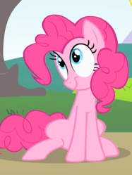
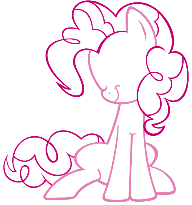
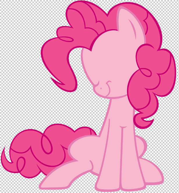
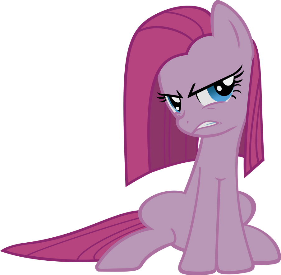
I do traces as well as original art, but the "vectoring" process I utilize is exactly the same, so I'll just start off pretending I'm about to do a trace of a screencap from the show. Let's make Pinkie Pie being adorable. Here is a decent image of her taken from the show. Notice how it is tiny. I want this image to be HUGE. Let's make a vector of it!
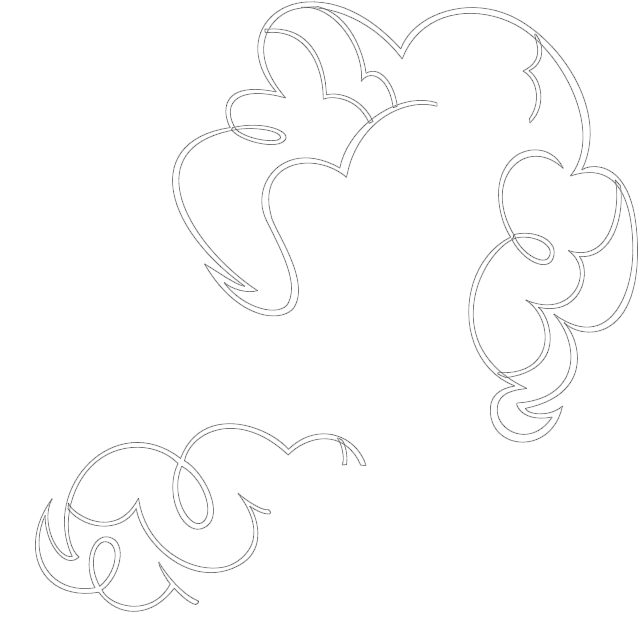
I begin by tracing the body outlines with the pen tool. However, instead of using the shapes like you normally would for vector images, I just use the regular pen tool to create paths that I then use to make selections and fill in later. I completely outline the body and other details like the nostrils and mouth.
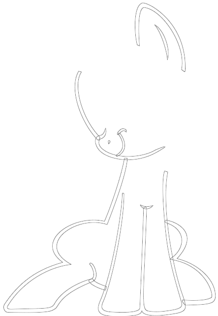
I then do the same for the mane and tail.
Now, you might be going "LOL what an idiot, why would he outline the strokes instead of just making a single path down the middle of the lines and using the Stroke option?"
NO. BAD. That is ugly, at least to me. Lines with the exact same width througout and with perfect, round ends are weird looking, especially for this style. I much rather emulate the exact look of the show with the imperfect lines and tapered ends.
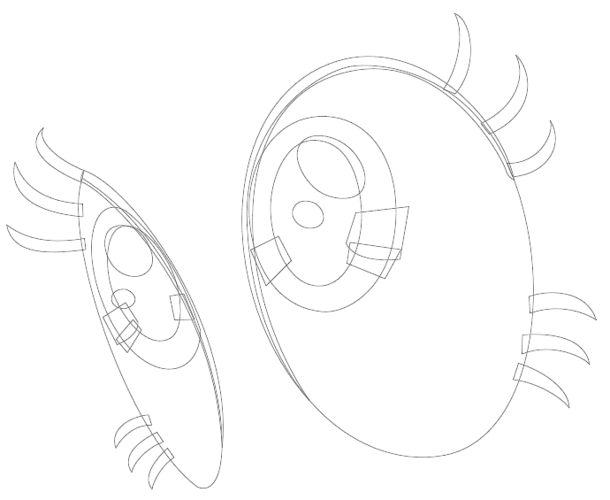
I do the eyes last since they are a bit more work.
D'AWWW! O-O Once the entire image and all its details have basically been outlined with paths, I make the selections and fill them in with the appropriate colors. I do the strokes first. Here are the mane, tail and body stroke layers all turned on.
Now, I've done enough of these thing to the point where I've come up with an organized system of folders and layers that I can use on pretty much any image I decide to make so that individual layers stack with minimal editing after they've been filled. If everything is done correctly, the only thing I usually have to do is remove a bit of overlapping mane and/or body strokes around the ear and the neck, depending on the angle of the image and style of hair.
This is my basic folder structure below:
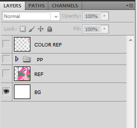
The PP folder you see in the above image is where everything for the vector is contained. the REF image is the reference image I am working from, obviously. I bet you can't guess what the BG layer is... (Wink)")
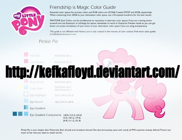
The very first layer you see, COLOR REF, is my color reference layer (NO WAY). If possible, I use 's color references that he has created. Unfortunately, he doesn't have these for every character, so sometimes this layer will just be the most correct-looking image I can find of the character I am working on, color-wise. Luckily, he has one of Pinkie Pie, so I used that. I highly suggest using his stuff, especially if you're making vector images like this.
Now I'll show you how I organize my folders and layers and continue to make sarcastic comments.
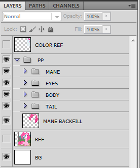
That image above is what's inside the PP folder. Amazing, is it not? (The "mane backfill" layer is simply a flattened copy of the mane I use as a gap-filler between the body and mane should any gaps be created once I've edited the stroke and fill layers of the mane so that they don't overlap the body stroke and fill where they aren't supposed to.
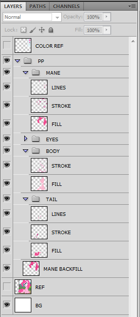
That image above is what you would find inside the folders. Again, incredible. You've probably never seen something so astounding. The "lines" layers are extra details in the mane and tail. I do that for a couple reasons that aren't worth explaining.
Now, once the lineart has been created, I use the magic wand to make appropriate selections with "sample all layers" turned on and expand the selection a bit so that it overlaps the lineart. I fill those selections with the proper color on the proper layer to create the fills.
There, finished! Wait...I'm forgetting something.
D'AWWW! O-O
EYEBALLS. She just needs some eyeballs. Just make all the outlines needed, make all the layers needed, make the selections needed and fill those suckers in. Apply a gradient to the iris layers for extra D'AWW effect and let it sit and cool for a few minutes while you go refill your drink. Come back, try and remember what it was you were working on, remember, and then double-check to make sure you've done everything right. Chances are you will forget something and will only notice right after you've uploaded it to DA or wherever and you'll rage. Luckily, you'll learn after doing this ten times in a row to KEEP RUNNING until you've uploaded the image and made sure that you didn't miss any errors. This will save you precious seconds while you go back to correct your failures and prevent an aneurism. Possibly.
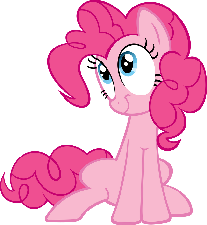
There we go, now it's done. And, just to show that my method isn't complete insanity and is actually quite modifiable, I created two variations:

Below, I present theidiot's beginner's guide to what all my layers are.
Folders are annotated with "-", capitalized, and bold, while the layers are italicized and underlined. If you are still confused as to which ones are the folders and which ones are the layers, well...can't help you there. I will add a note to anything that might require it.
-MANE
stroke
fill
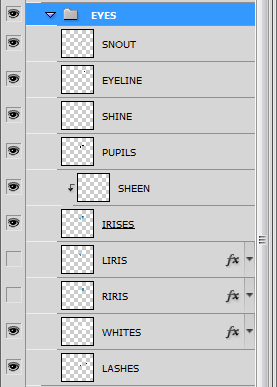
-EYES
snout/cheek (if the image is at an angle where part of the eye is behind their nose, or if their eye is squinted so that a body-stroke-toned line is used, this will be part of the body stroke made to overlap it.)
eyeline (the black outlines usually used around the upper part of the eyes)
eye shine (the white higlight spots)
pupils
iris sheen (the two-tone "sheen" of the iris.)
irises (generally the only layer that I ever apply a gradient to on these types of images.)
whites
lashes
-CUTIE MARK
whatever layers it takes to create the cutie mark go in here. Sometimes I will place this folder inside the BODY folder under the stroke layer if it requires it.
-BODY
stroke
shadefill (if parts of the body (usually the farther legs) are in shadow, this layer is for that.)
fill
-TAIL
stroke
fill
And that is the folder structure I start off with every time. Sometimes the image will require more (or less) than that, and I add stuff as needed. Hopefully it will help you understand how I layer everything with little hassle.
NOW FOR SOME AWESOME MOVIES (not really that awesome, they are really boring and only useful if you want to actually see me making things.)
To help you understand all this, I have two different videos below. These, combined with the above description, is the next best thing I can do short of physically coming to your house and showing you what I do in person, so I hope you understand everything I've said. I'm not very good at writing instructions and walkthroughs, I'm afraid.")
this one starts out at normal speed to give viewers the chance to see what I'm doing but I bump the speed up to 4x I think somehere about halfway through it. www.youtube.com/watch?v=7jEqBJ…
This one is just a really fast runthrough : www.youtube.com/watch?v=SIjQH4…
I hope I didn't forget anything. If you have any more questions, feel free to ask. (Smile)")
Oh, and these usually take me aright around an hour each.
Before I say anything, if you're familiar with proper vectoring at all then once you've heard what I do you'll realize I'm not making "true" vectors with the process I use. This might seem a bit odd because what I do means that if I wanted to make a larger version of the image I would basically have to scale the paths I've made and re-"paint" the whole image, but I'm just doing these for fun so I make them large to begin with; the end result is plenty big for anything anyone who might use them for. For simplicity's sake, I will still refer to the image I am creating as a vector from hereon out.
(If you don't want to read my monilith o' text and just want to watch some movies, scroll down to the bottom)
I do traces as well as original art, but the "vectoring" process I utilize is exactly the same, so I'll just start off pretending I'm about to do a trace of a screencap from the show. Let's make Pinkie Pie being adorable. Here is a decent image of her taken from the show. Notice how it is tiny. I want this image to be HUGE. Let's make a vector of it!
I begin by tracing the body outlines with the pen tool. However, instead of using the shapes like you normally would for vector images, I just use the regular pen tool to create paths that I then use to make selections and fill in later. I completely outline the body and other details like the nostrils and mouth.
I then do the same for the mane and tail.
Now, you might be going "LOL what an idiot, why would he outline the strokes instead of just making a single path down the middle of the lines and using the Stroke option?"
NO. BAD. That is ugly, at least to me. Lines with the exact same width througout and with perfect, round ends are weird looking, especially for this style. I much rather emulate the exact look of the show with the imperfect lines and tapered ends.
I do the eyes last since they are a bit more work.
D'AWWW! O-O Once the entire image and all its details have basically been outlined with paths, I make the selections and fill them in with the appropriate colors. I do the strokes first. Here are the mane, tail and body stroke layers all turned on.
Now, I've done enough of these thing to the point where I've come up with an organized system of folders and layers that I can use on pretty much any image I decide to make so that individual layers stack with minimal editing after they've been filled. If everything is done correctly, the only thing I usually have to do is remove a bit of overlapping mane and/or body strokes around the ear and the neck, depending on the angle of the image and style of hair.
This is my basic folder structure below:
The PP folder you see in the above image is where everything for the vector is contained. the REF image is the reference image I am working from, obviously. I bet you can't guess what the BG layer is...
The very first layer you see, COLOR REF, is my color reference layer (NO WAY). If possible, I use
's color references that he has created. Unfortunately, he doesn't have these for every character, so sometimes this layer will just be the most correct-looking image I can find of the character I am working on, color-wise. Luckily, he has one of Pinkie Pie, so I used that. I highly suggest using his stuff, especially if you're making vector images like this.Now I'll show you how I organize my folders and layers and continue to make sarcastic comments.
That image above is what's inside the PP folder. Amazing, is it not? (The "mane backfill" layer is simply a flattened copy of the mane I use as a gap-filler between the body and mane should any gaps be created once I've edited the stroke and fill layers of the mane so that they don't overlap the body stroke and fill where they aren't supposed to.
That image above is what you would find inside the folders. Again, incredible. You've probably never seen something so astounding. The "lines" layers are extra details in the mane and tail. I do that for a couple reasons that aren't worth explaining.
Now, once the lineart has been created, I use the magic wand to make appropriate selections with "sample all layers" turned on and expand the selection a bit so that it overlaps the lineart. I fill those selections with the proper color on the proper layer to create the fills.
There, finished! Wait...I'm forgetting something.
D'AWWW! O-O
EYEBALLS. She just needs some eyeballs. Just make all the outlines needed, make all the layers needed, make the selections needed and fill those suckers in. Apply a gradient to the iris layers for extra D'AWW effect and let it sit and cool for a few minutes while you go refill your drink. Come back, try and remember what it was you were working on, remember, and then double-check to make sure you've done everything right. Chances are you will forget something and will only notice right after you've uploaded it to DA or wherever and you'll rage. Luckily, you'll learn after doing this ten times in a row to KEEP RUNNING until you've uploaded the image and made sure that you didn't miss any errors. This will save you precious seconds while you go back to correct your failures and prevent an aneurism. Possibly.
There we go, now it's done. And, just to show that my method isn't complete insanity and is actually quite modifiable, I created two variations:
Below, I present the
Folders are annotated with "-", capitalized, and bold, while the layers are italicized and underlined. If you are still confused as to which ones are the folders and which ones are the layers, well...can't help you there. I will add a note to anything that might require it.
-MANE
stroke
fill
-EYES
snout/cheek (if the image is at an angle where part of the eye is behind their nose, or if their eye is squinted so that a body-stroke-toned line is used, this will be part of the body stroke made to overlap it.)
eyeline (the black outlines usually used around the upper part of the eyes)
eye shine (the white higlight spots)
pupils
iris sheen (the two-tone "sheen" of the iris.)
irises (generally the only layer that I ever apply a gradient to on these types of images.)
whites
lashes
-CUTIE MARK
whatever layers it takes to create the cutie mark go in here. Sometimes I will place this folder inside the BODY folder under the stroke layer if it requires it.
-BODY
stroke
shadefill (if parts of the body (usually the farther legs) are in shadow, this layer is for that.)
fill
-TAIL
stroke
fill
And that is the folder structure I start off with every time. Sometimes the image will require more (or less) than that, and I add stuff as needed. Hopefully it will help you understand how I layer everything with little hassle.
NOW FOR SOME AWESOME MOVIES (not really that awesome, they are really boring and only useful if you want to actually see me making things.)
To help you understand all this, I have two different videos below. These, combined with the above description, is the next best thing I can do short of physically coming to your house and showing you what I do in person, so I hope you understand everything I've said. I'm not very good at writing instructions and walkthroughs, I'm afraid.
this one starts out at normal speed to give viewers the chance to see what I'm doing but I bump the speed up to 4x I think somehere about halfway through it. www.youtube.com/watch?v=7jEqBJ…
This one is just a really fast runthrough : www.youtube.com/watch?v=SIjQH4…
I hope I didn't forget anything. If you have any more questions, feel free to ask.
Oh, and these usually take me aright around an hour each.

DeviantArtist Questionnaire
How long have you been on DeviantArt? - On this (my second) account, over 4 years. Since my original account, over 8 years.
What does your username mean? - Moongaze is the name of my pony character, and the account is called MoongazePonies because Moongaze is taken (and a dead account, what a waste...) and this account is dedicated to making MLP artwork, so MoongazePonies it was.
Describe yourself in three words. - quiet, observant, easygoing
Are you left or right handed? - left-handed
What was your first deviation? - On this account, probably this -
What is your favourite type of art to create? - Digital art
If you could instantly mas
Win a Vector of your OC! - Poll Winner(s)!
Congratulations to
Win a Vector of your OC! - Winners and Poll
Good evening!
Whew! So yeah, that was a pretty tough time trying to select the winners. I spent a lot of time going through them all over and over, to the point where I'm a day late announcing the winners. :P I wanted to sleep on it before making my final decision, but now it's time to announce the two winners, as well as the ten finalists for the community poll to select the third winner!
Congratulations to !Foxtaile (https://www.deviantart.com/foxtaile) FluffyFeah and :iconJoieArt: JoieArt! Their respective ponies Mint Breeze and Confetti Cake are the winners!
Now I want to stress that this doesn't mean that I consider all of the other contestant ponies inferior by an
Win a Free OC vector - Contest - stage 2
Good evening! The deadline has been reached, and no further entries will be accepted into the contest. I will now begin to evaluate each submitted character and choose the two immediate winners. Keep an eye on my journal entries for news of the two winners and the poll for you, the community, to select the third winner!
Here are all of the contestants and their ponies. For more info about their characters as well as details of the contest, read the comments on the original contest journal, located HERE
Current Contestants (34)
© 2011 - 2024 MoongazePonies
Comments243
Join the community to add your comment. Already a deviant? Log In
i use freaking GIMP!!!! THERE IS NO FREAKING PEN TOOL IN GIMP DANGIT!!! me: wheres the pen tool? *looks up pen in help* theres no pen! 
 screw gimp
if u use gimp plz reply "Yes"
screw gimp if u use gimp plz reply "Yes"